You have seen these bright colours on the catwalk and you certainly love them. You might also wonder if you would dare something so bold. By coincidence, you have a bright red pair of trousers in your wardrobe. It is still waiting to be matched and finally come out to the light.
You are not alone. For sure. We have all loved a bright colour combination. Some of us may have also attempted wearing it and others have been avoiding it for ever.
There are always those who swear by neutral colours and would never add some «spice» to their palette.
Whichever the category you belong to, here are a few smart tips to make you go vibrant, next time. You will surely find your favourites and those that fit your taste.
1.
First things first. Here I present the Colour Wheel, first initiated by Isaac Newton in 1666.
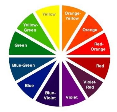
According to the wheel:
Complementary colours
Every colour matches well with the colour right next to it. For instance orange matches red and so on.
Opposite or analogous colours
Every colour matches perfectly with the opposite to it. For instance orange matches blue.
Colours that form an X
This is a four colours combination. Their position on the wheel creates a perfect X.
For instance yellow, violet, red-orange and blue-green or orange, violet-red, blue and yellow-green.
2.
Monochromatic
Choose the colour you love and matches your complexion and hair. Wear it from head to toe. Monochromatic outfits show off the silhouette and are impressive when in bold colours.
3.
Monochromatic and Prints
Match a one-colour piece with a printed one. Choose your monochromatic piece to be the colour of the printed palette. In other words, a printed skirt in multicolours goes well with a yellow blouse, if yellow is also a colour of the skirt.
4.
Neutral colours
Neutral colours or earthy tones are not part of the Colour Wheel. These colours are black, brown, grey and beige. Almost all colours of the wheel match well with the neutrals
You can complete a bright colour outfit with accessories, a bag and shoes in neutral colours.
5.
Two colours of the same tone
Go for a colour that is one or two tones brighter than your main. For instance a purple pair of trousers with a lilac shirt. It is better if you start darker at the bottom and finish of brighter on top. This creates a more harmonious visual effect.
Finally, white is a key player that matches everything.
Bright colours are an ally for maturity. The older we get these bright colours accentuate our energy levels, our vivacity and good mood. Let’s wear them, even though mainstream thinking only allows for pale and neutral colours for a mature woman.
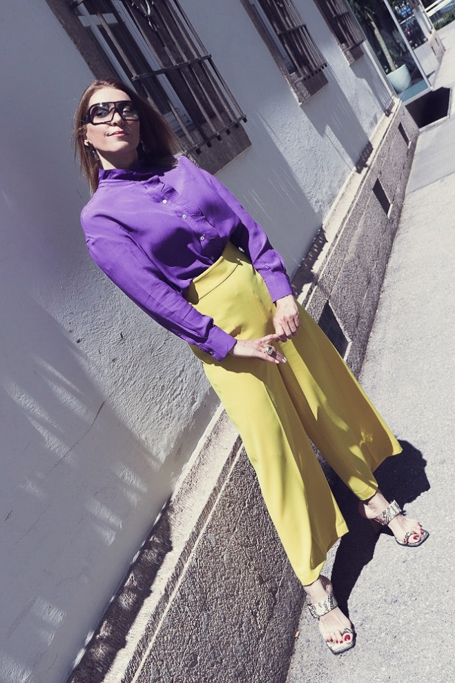
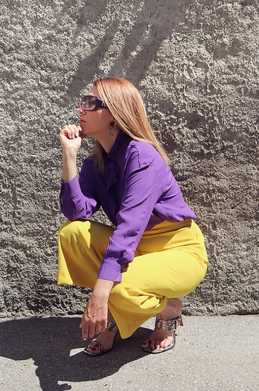
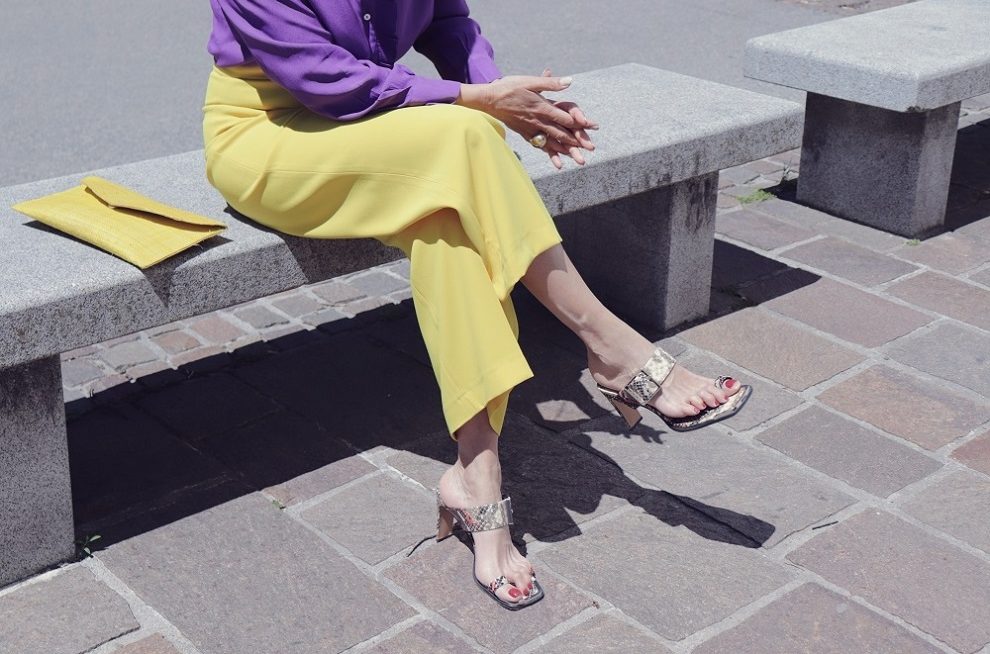
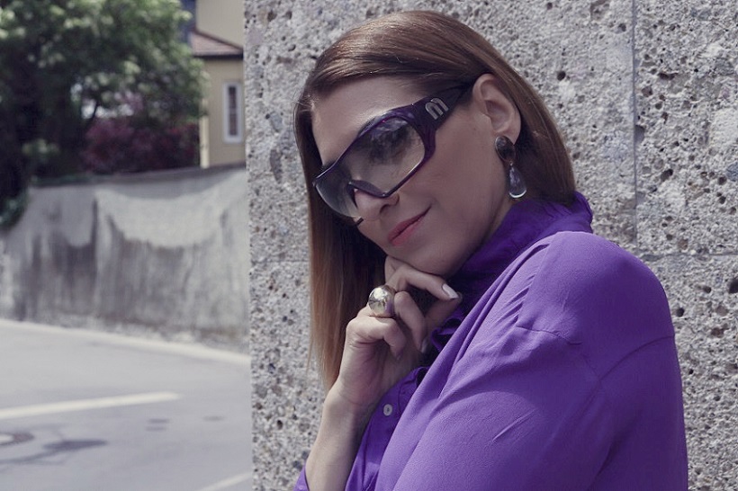
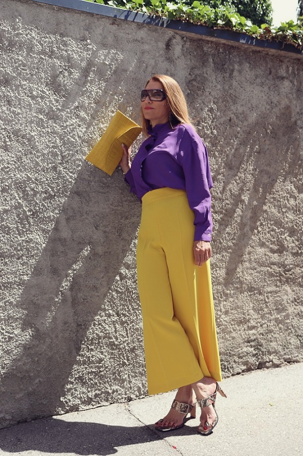
Today, I wore two bright colours. Yellow and purple. A pair of snake mules and a yellow, mini, envelope shaped, straw shoulder bag complete the look.

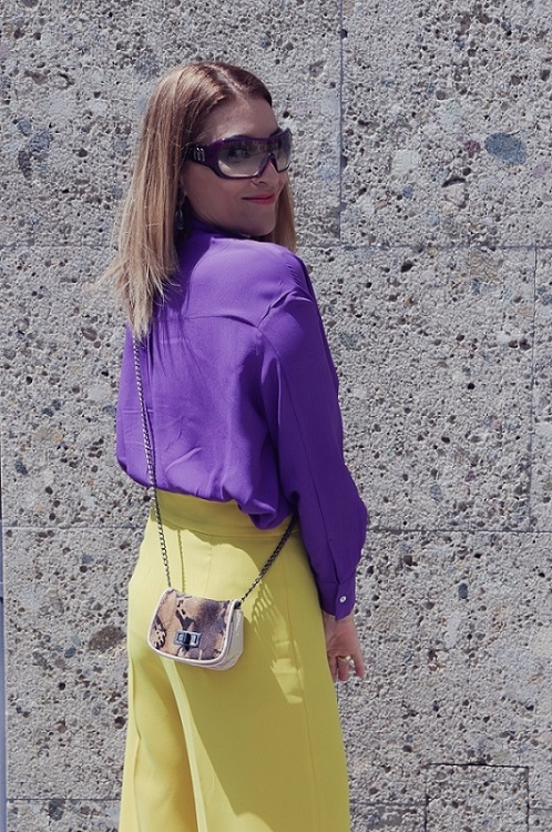
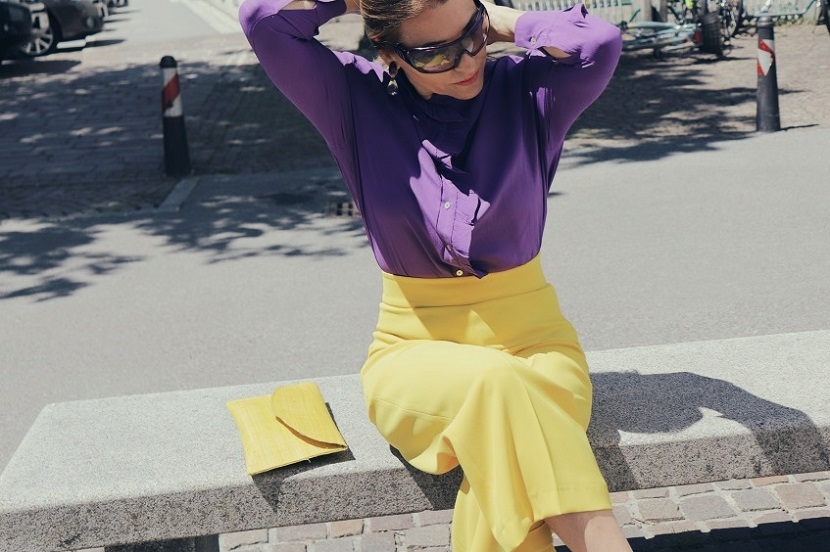
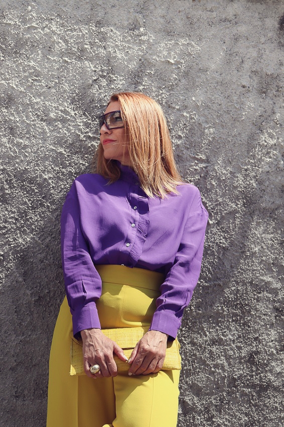



I hope that I clarified some grey areas for you with bright answers on the colour combos.
Do get in touch if you need more information on anything colourful.
WEARING: trousers : ZARA, shirt : ZARA, shoes : TOP SHOP, clutch bag : no name (old), mini bag : Custo Barcelona (old), sunglasses : Miu Miu (old).


